Callaway Golf Pre-Owned
Redesigning the e-commerce experience for Callaway Golf's Pre-Owned brand, driving increased sales through enhanced mobile design.
During my time at Callaway Golf, I was the lead UX designer of their Pre-Owned brand. In this role, I was responsible for modernizing their e-commerce platform, enhancing user experience, and driving increased sales through enhanced mobile design.
Users
Consumers ranged from casual golfers looking for affordable equipment to avid players seeking high-quality used clubs. The platform also catered to sellers wanting to trade in their old gear.
Problem
Callaway Golf Pre-Owned's existing e-commerce platform was outdated and not optimized for mobile users, despite performing well on sales. Enhancing the user experience meant there was more opportunity to increase conversion rates and customer satisfaction, and unlock greater revenue.
Goals
Redesign the e-commerce platform with a mobile-first approach. Improve navigation, product discovery, and checkout processes to boost conversion rates and overall sales.
Impact
Home Page
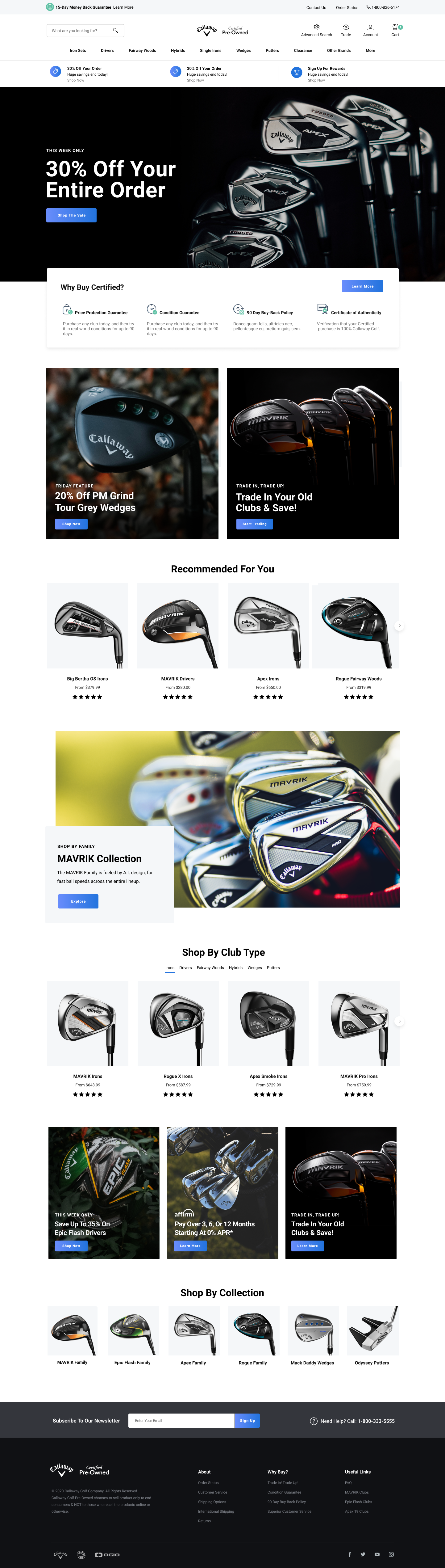
The old homepage was capped at a fixed 975px width. It never adapted past that on larger screens, and looked stretched or cramped everywhere else. It also had no way to spotlight secondary products, so everything competed for the same real estate. I rebuilt the layout to be fully responsive across breakpoints and introduced modular blocks the content team could use to promote secondary product lines without needing engineering involvement.

Product Page
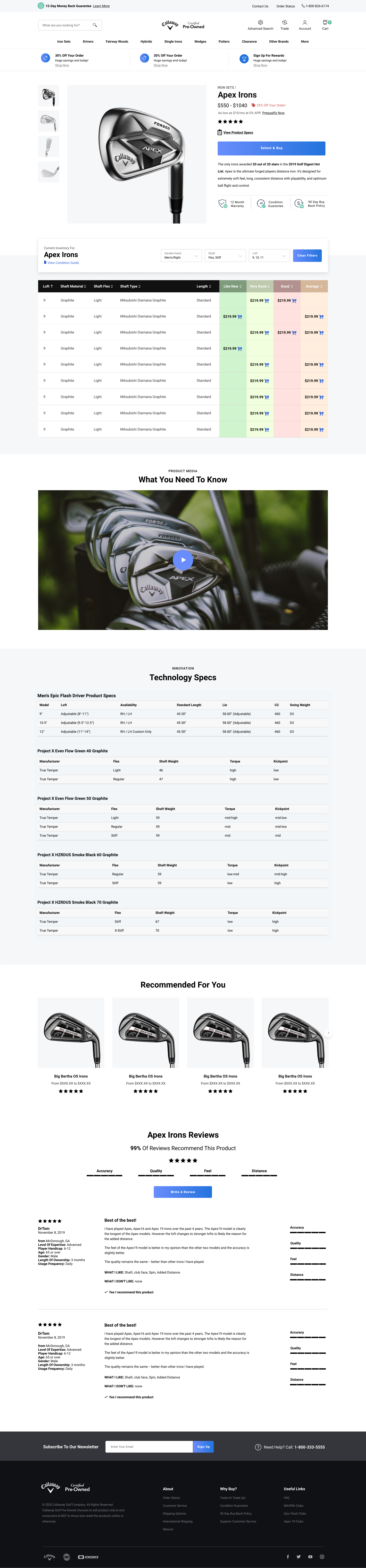
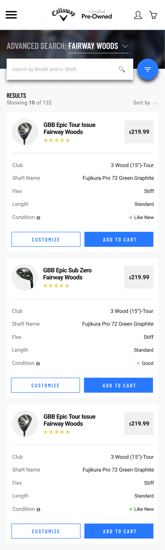
The product page already listed individual inventory items in a table, necessary since every piece of used equipment is a unique unit with its own condition and price, but the table itself was awkward to scan and use, especially on mobile. I replaced it with a card-based layout on mobile and pinned a fixed add-to-cart row to the desktop layout so purchasing a specific unit stayed one action away no matter how far a shopper scrolled.

Category Page
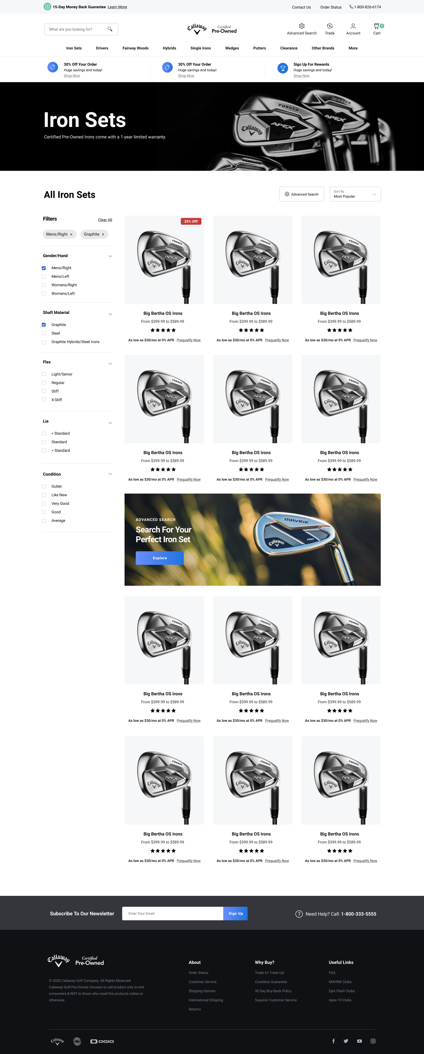
The category browsing experience carried over largely as-is from the previous site. The update here was mostly about bringing it in line visually with the rest of the new design system rather than restructuring how it worked.
Advanced Search
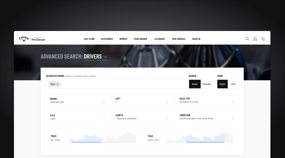
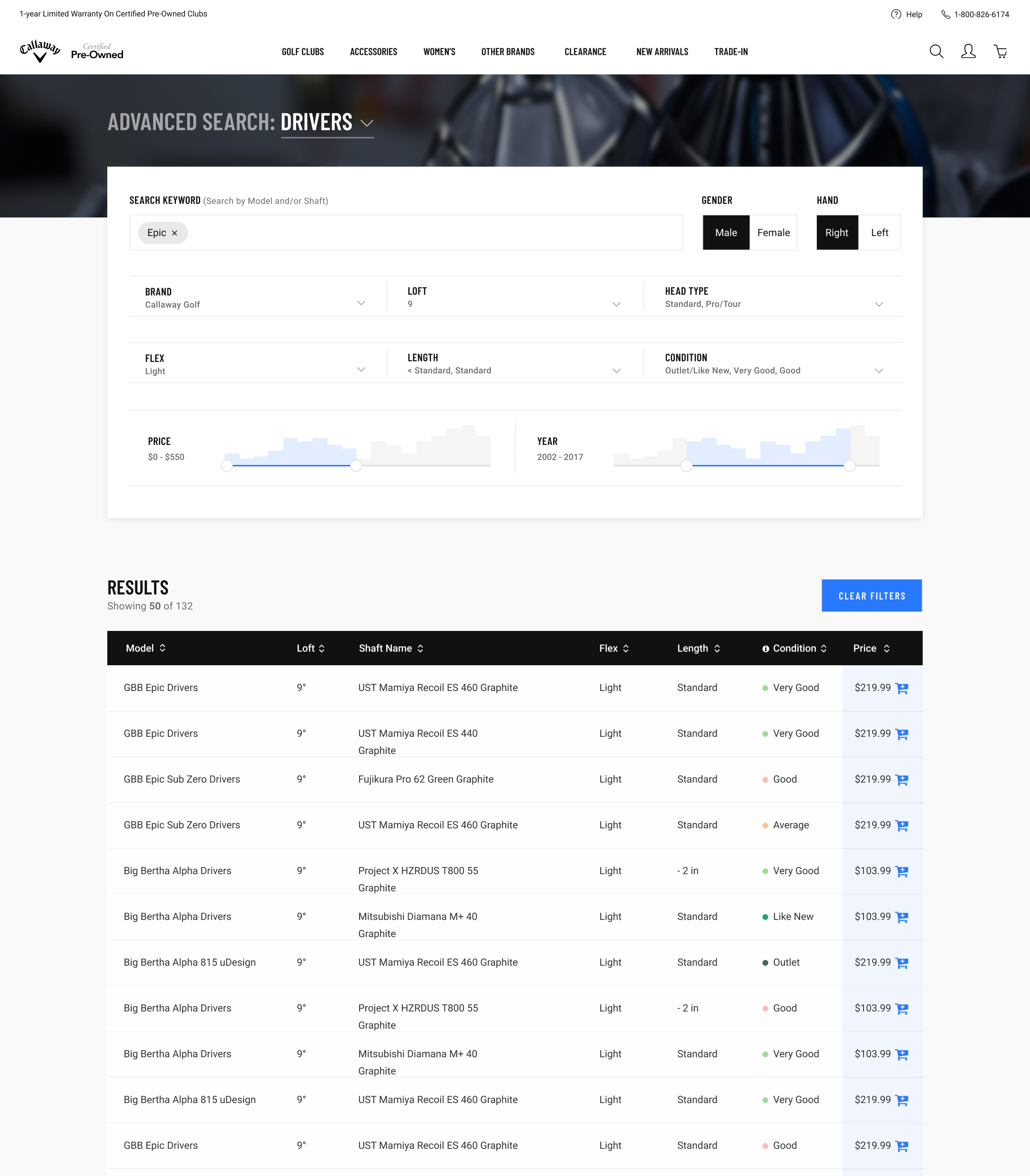
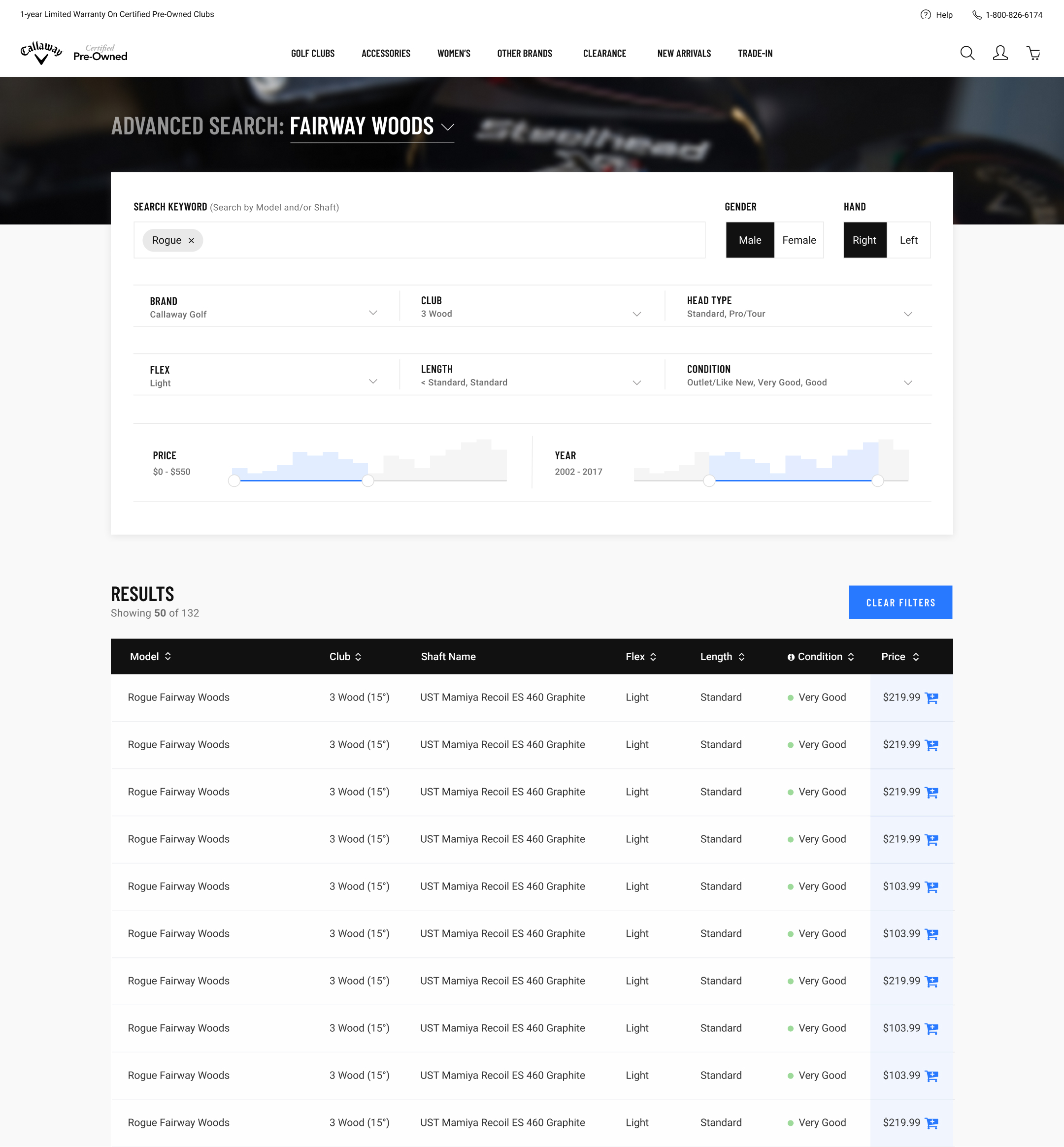
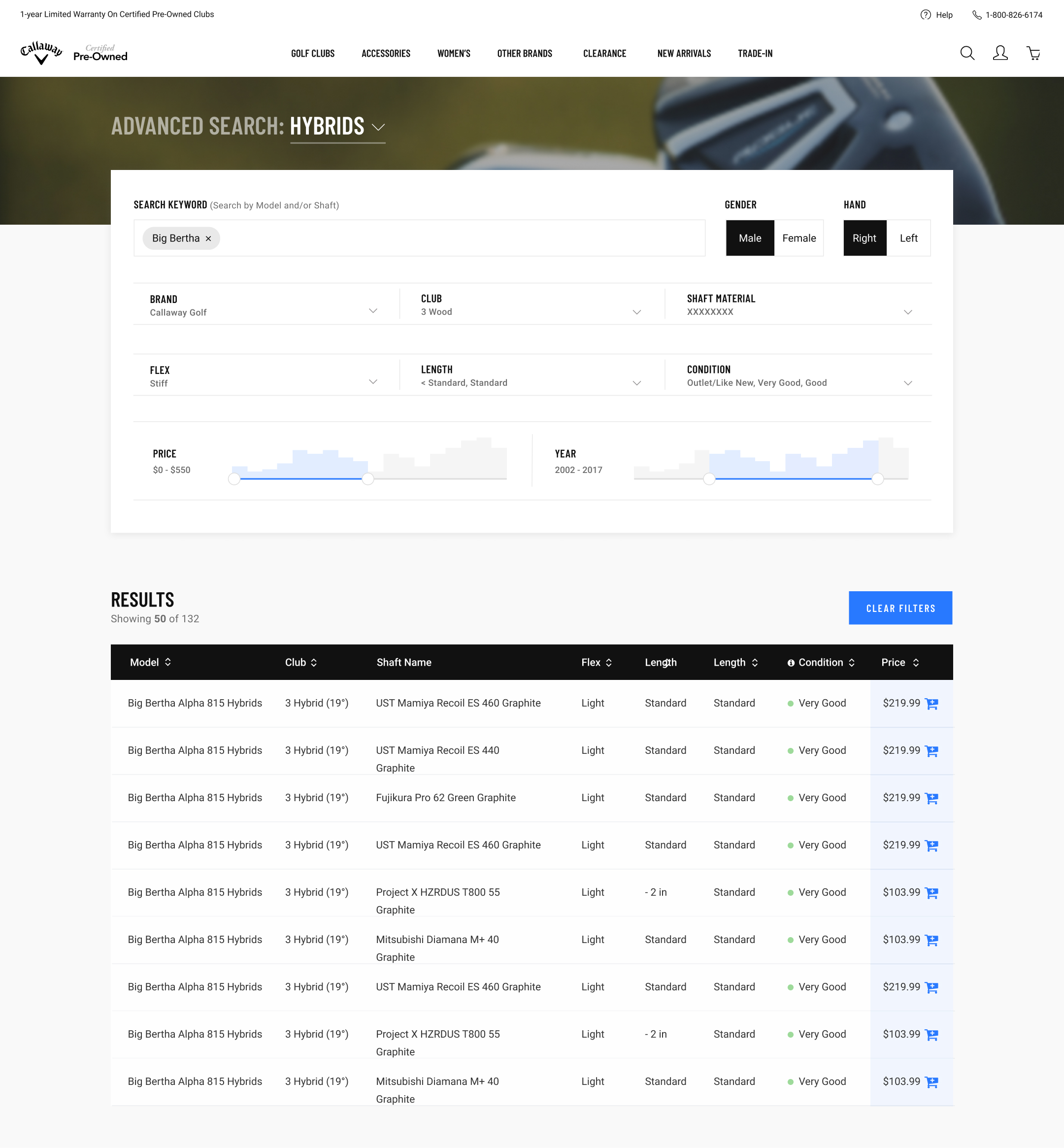
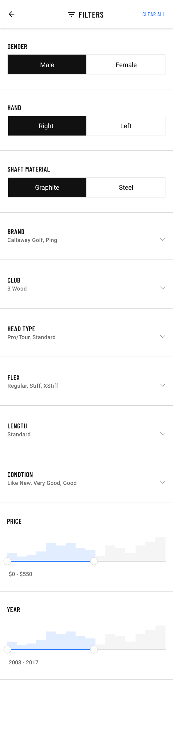
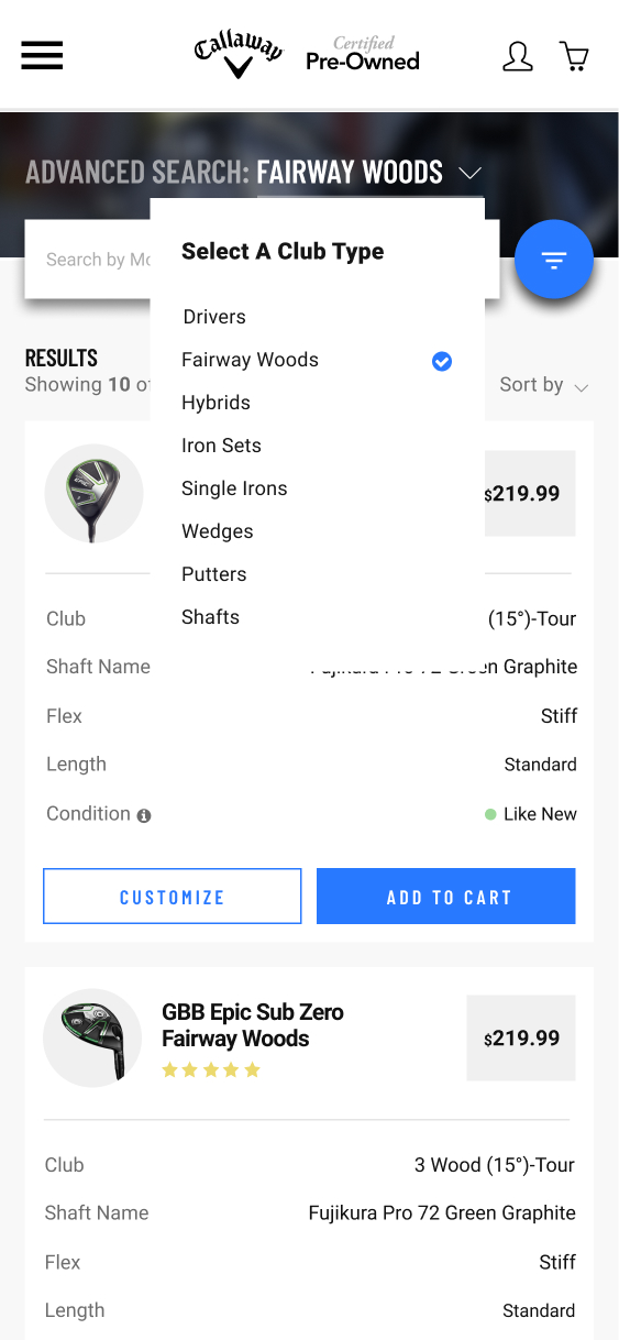
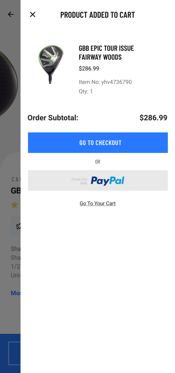
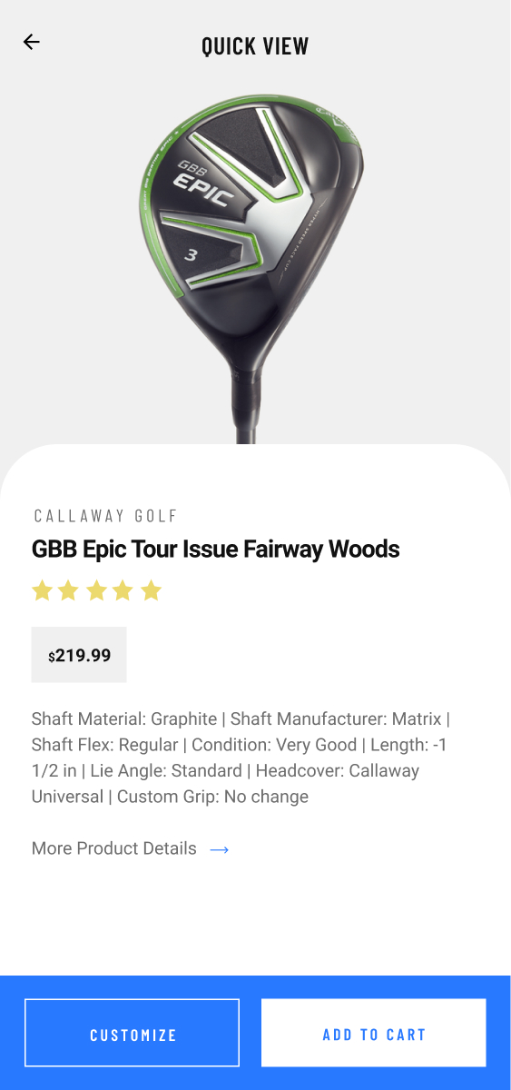
Shoppers had no way to filter by club type, brand, or condition before this. Narrowing a search meant scrolling through full category listings by hand. I designed advanced search as a net-new feature, including mobile-specific patterns like skeleton loading, quick-view, and adding to cart directly from the results grid, since most of the site's growth was coming from mobile.

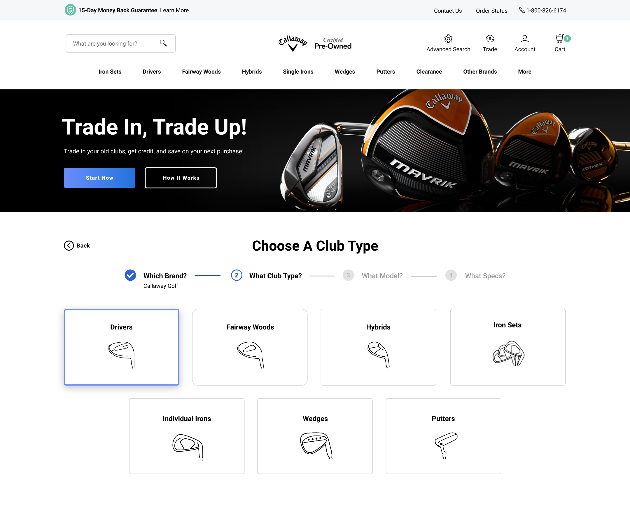
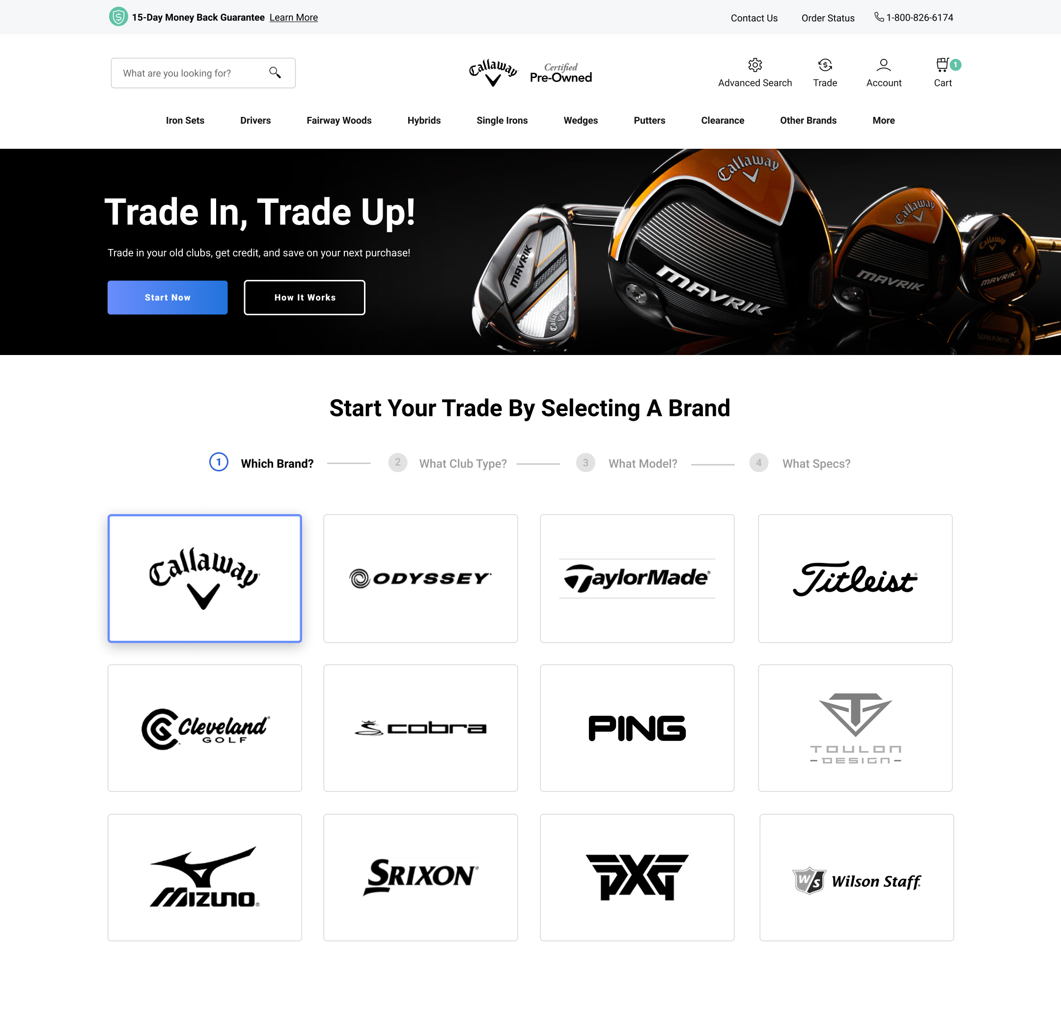
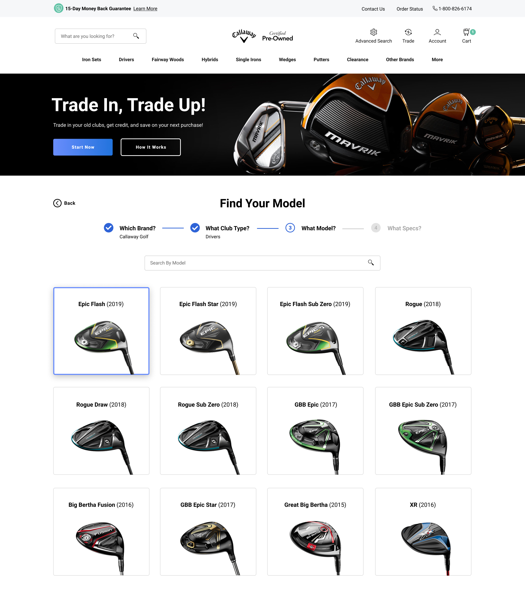
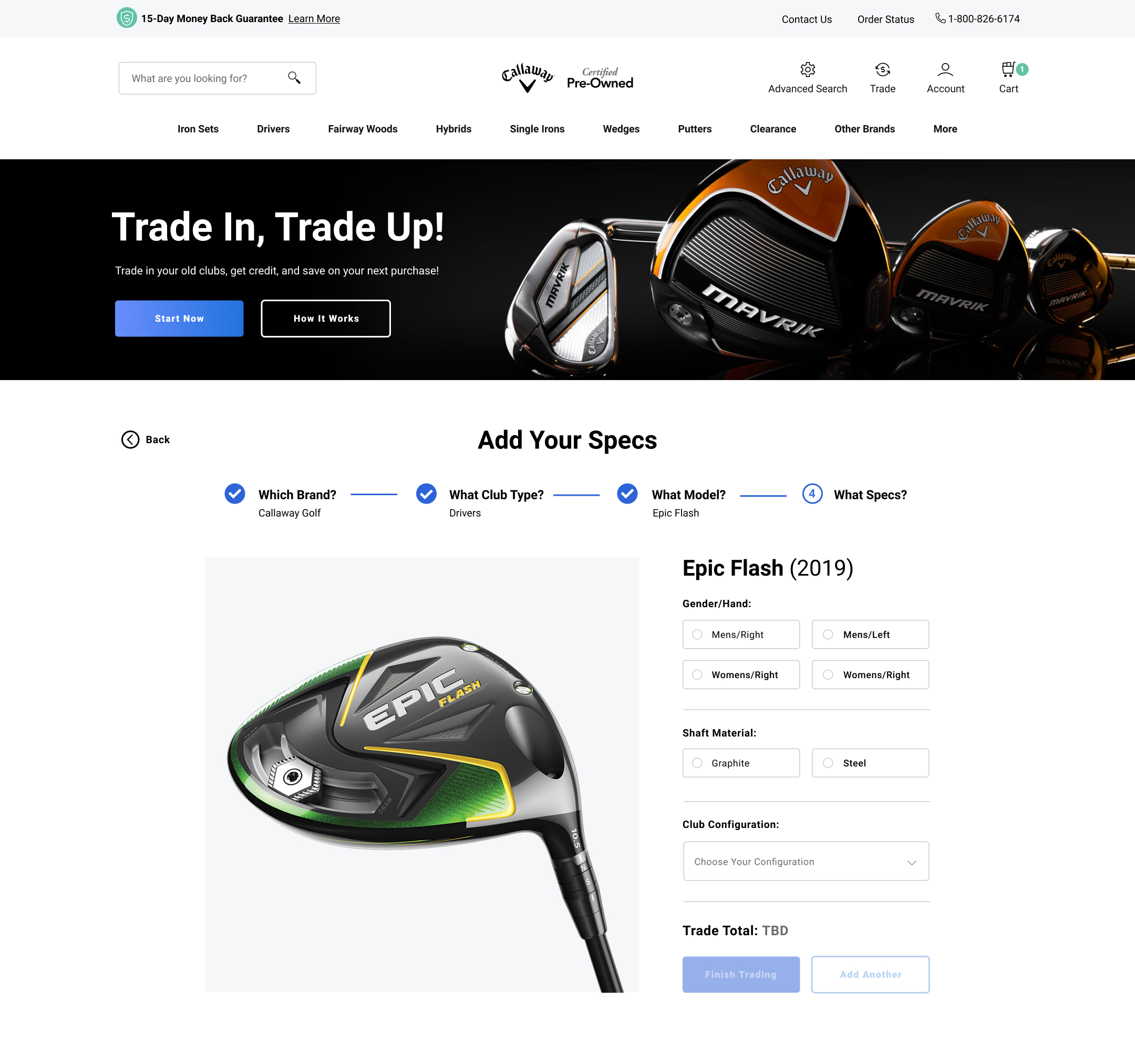
Trade In Page
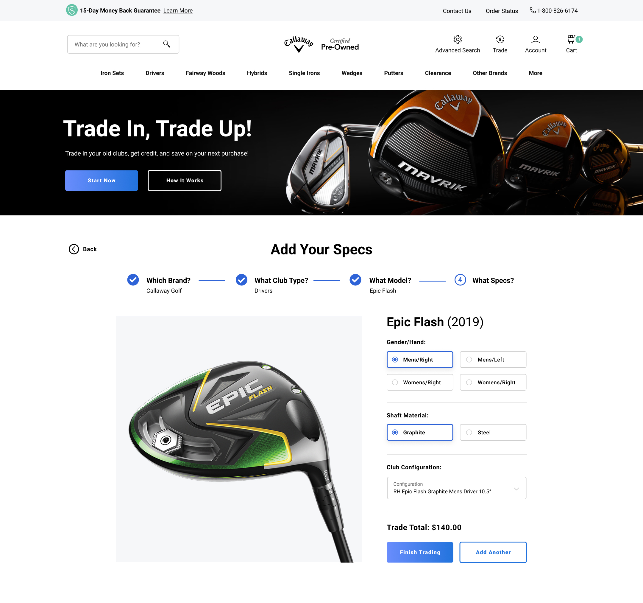
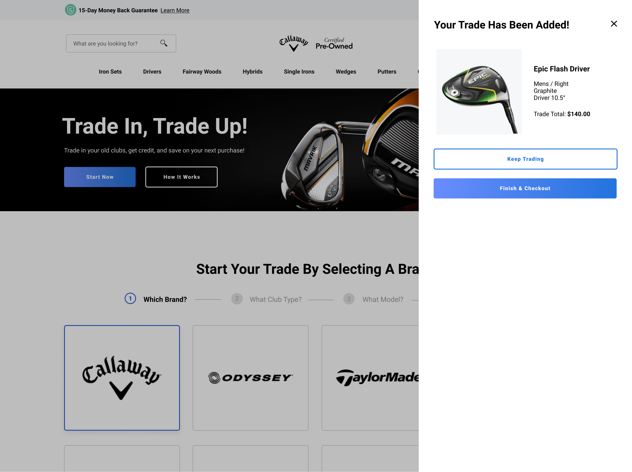
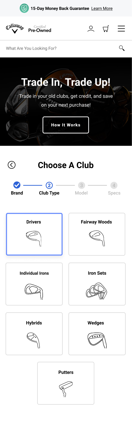
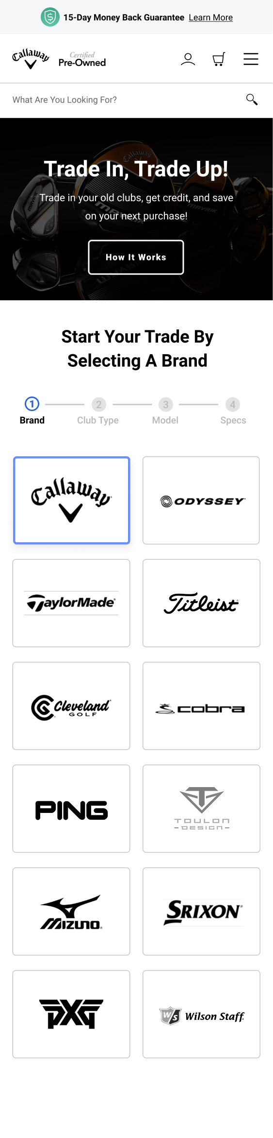
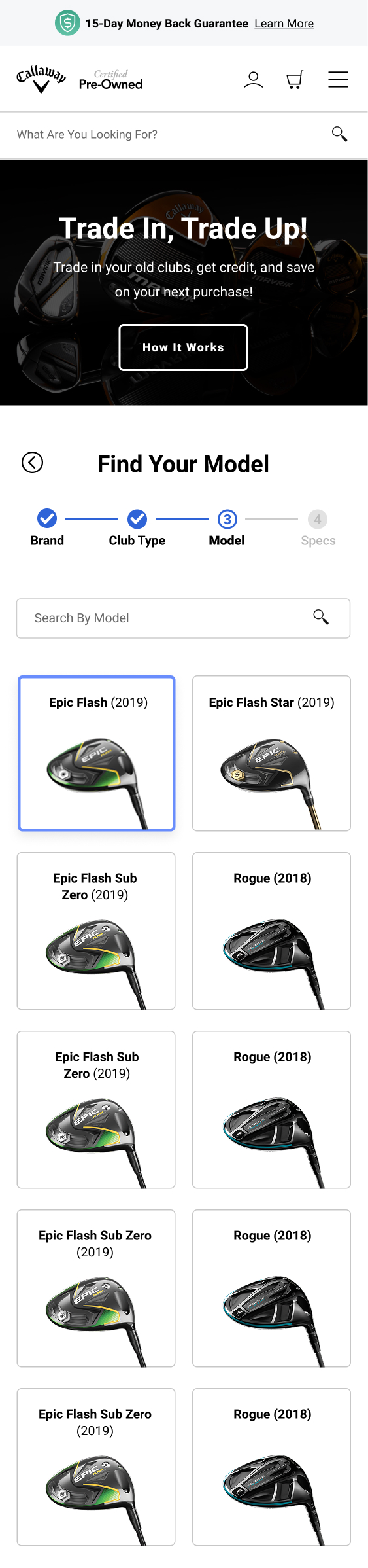
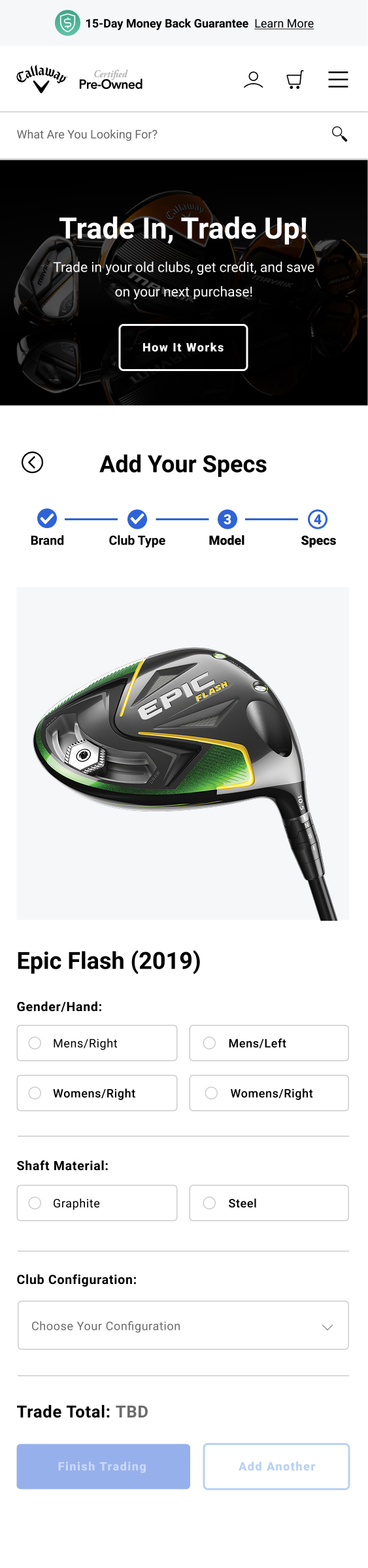
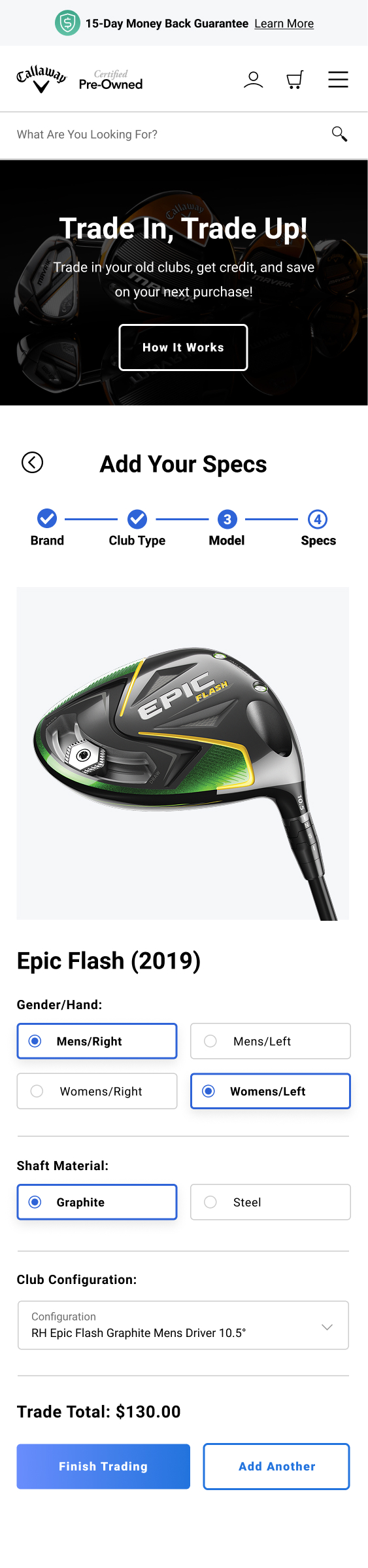
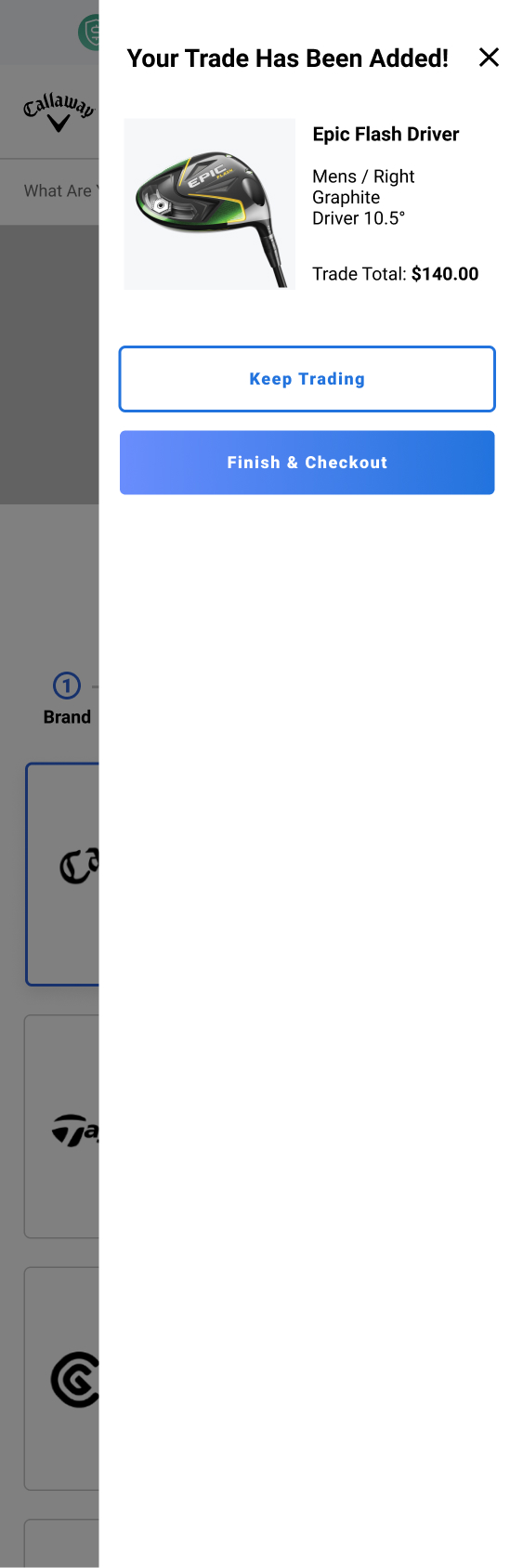
Trading in old equipment previously meant filling out one long, cumbersome form covering club type, brand, model, and condition all in a single pass. I broke it into a guided step-by-step flow, one decision at a time, for both desktop and mobile, so sellers were never staring at a wall of fields at once.