Located in Pittsburgh, PA
Case Study
OGIO
Rebuilding a heritage brand's e-commerce store from the ground up.
Overview
OGIO's acquisition by Callaway Golf in 2017 was a turning point. The brand had strong heritage but its digital presence hadn't kept pace — an aging site, inconsistent branding, and a poor mobile experience were letting the product down. With a full product and brand overhaul underway, I redesigned the e-commerce store from scratch to match the new direction.
Users
400k+ monthly users across the US, Canada, and Europe seeking premium golf and lifestyle bags, backpacks, and apparel.
Problem
An aging, non-responsive website with fragmented branding that undermined OGIO's relaunch. The browsing and purchasing experience created friction at every step and failed to reflect the quality of the products.
Goals
Design a new e-commerce experience that matched the energy of the brand relaunch — clean, modular, and flexible enough for the marketing team to manage at scale without custom dev work.
Company
Callaway Golf
Roles
Research, UX & UI Design, Prototyping
Timeline
2018 - Onwards
Impact
+2.5%
Conversion rate
Increase in conversion rate following the redesign launch.
+18.5%
Mobile users
Growth in mobile users on the redesigned, fully responsive site.
-1.5%
Bounce rate
Reduction in bounce rate as the new experience improved engagement.
2:09
Avg time online
Average session duration post-launch.
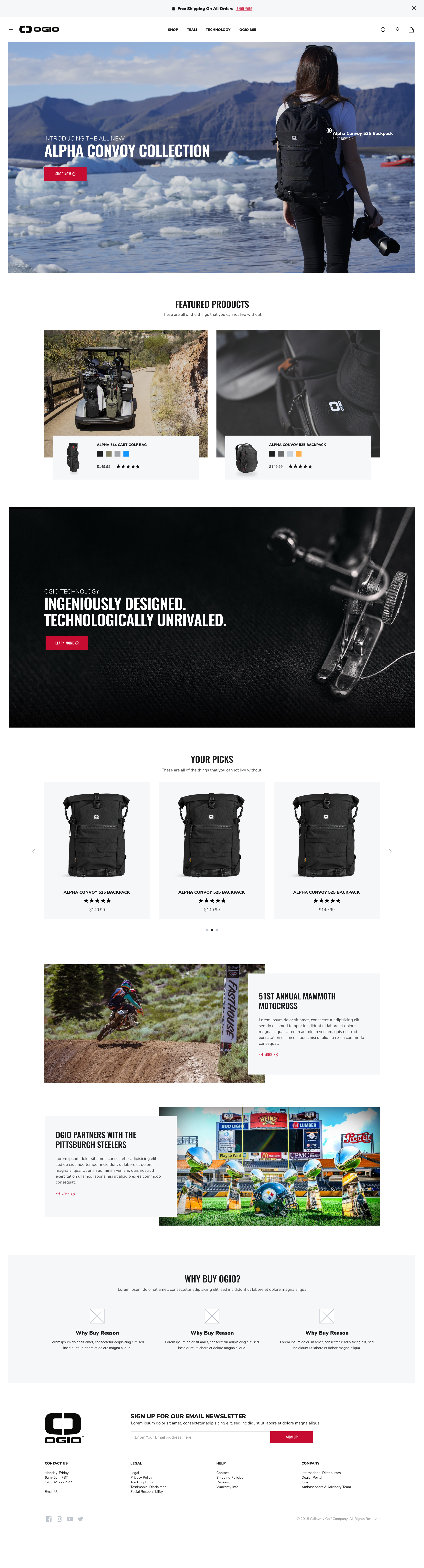
Research & direction
I started by mapping the site's structural hierarchy and running competitor analysis to understand where the market was heading. This fed directly into wireframes produced alongside the Director of Digital Marketing — the competitor analysis made clear that the category was moving toward editorial-style layouts that let product photography lead, which shaped every structural decision that followed.
The new photography and product palette were pushing the brand toward something brighter and more confident, so I kept the UI clean and restrained to let the visuals do the work. We landed on Oswald for headers — a condensed typeface that holds up in large hero treatments and keeps layouts from feeling cluttered even with rich content.
A modular design system
Workshopping with the OGIO marketing team revealed a core need: flexibility. Different pages would serve different purposes — product spotlights, editorial content, promotional callouts — and the team needed to be able to compose them independently without a dev ticket each time. I designed a library of product and content modules that could be mixed and matched across any page, giving marketing real ownership over the site post-launch.
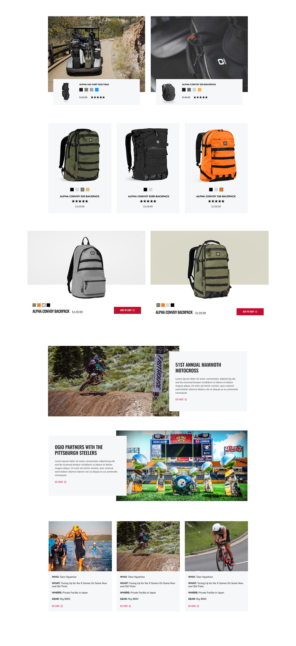
Composing the home & landing pages
With the module library in place, the home page and campaign landing pages were built by composing components to suit each page's content goal. The system meant the marketing team could update and reorder pages around product launches and seasonal campaigns without the design or engineering team being a bottleneck.

Rethinking the product page
The original PDP buried key information, had no clear visual hierarchy, and made the purchase decision harder than it needed to be. The redesign brought the product hero front and centre above the fold, surfaced size, colour, and buy options immediately, and restructured the lower page around the content that actually drives conversion — specs, social proof, and complementary products.