Located in Pittsburgh, PA
Case Study
Canopy App
Making satellite data truly accessible and on‑demand.
Overview
Umbra Space, a leading provider of space imaging, set out to make satellite data truly accessible and on‑demand. Canopy was created to let users get imagery without the antiquated hurdles of phone calls and spreadsheet orders.
Users
US Government defense and intelligence agencies, sovereign nations, image resellers, analytics companies, defense and intelligence agencies, journalists, scientific researchers.
Problem
Users struggled to order from the platform and use technical parameters. The app needed a polished, consistent design and the MVP missed key features—like ordering at scale. Customers leaned on our support team due to shortcomings.
Goals
Steer Canopy from an MVP to a fully-featured product. Introduce new functionality and offerings to help serve customer’s missions. Improve usability and iterate on the design to make the app a joy to use.
Company
Umbra Space
Roles
End to end UX research and design. UX Engineering and prototyping
Team
Lead product designer (self), Product manager, software engineering, flight software lead.
Timeline
2025 Q1 – Q3
Impact
42%
Increase in user engagement
Users increased their time using the app on mobile and tablet devices
1.3x
More self service tasks
Monthly orders went up as users adopted self-service bulk ordering features.
89%
Positive user feedback
Users spoke positively about the improved usability and additional features
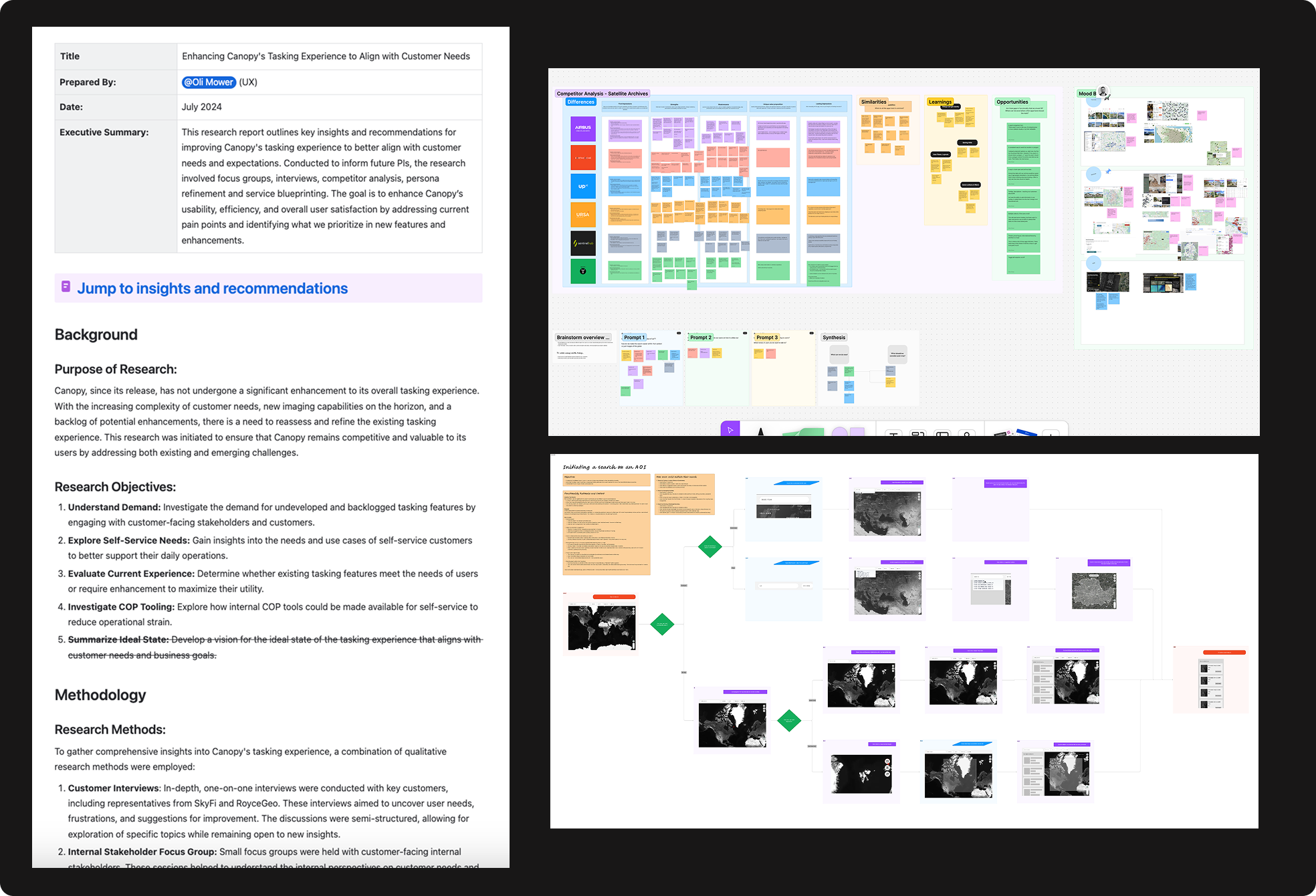
Research
Interviews & Personas
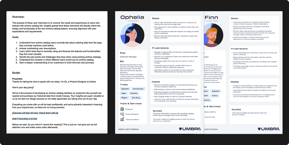
Working closely with the Product Manager, we interviewed customers to learn more about what they’re trying to achieve and where they might be experiencing difficulty with our beta platform. This gave us far greater insight into how our app fit into their overarching work, and provided the opportunity to form personas that gave insight into the different user types and their goals, frustrations, and needs.
User Journeys, Service Blueprints, Surveys
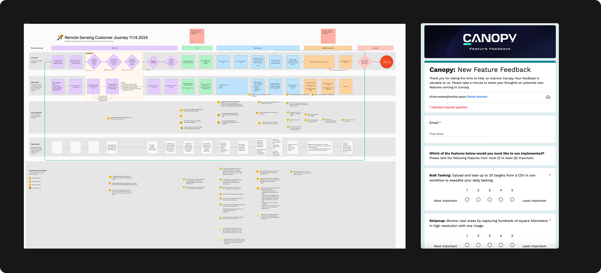
We also used the information we gathered to create other artifacts like user journeys and service blueprints to help map and visualize problem areas along a typical customer journey. Once we’d narrowed down our primary pain points across missing functionality, features and user experience, we sent a survey to further validate the priority in which we should approach improving the web application.
Report Findings, Explore Solutions
I packaged up my research into a report to help with sharing my research with business owners and key stakeholders. This allows me to get buy-in from those above by showing that proposals for improvements are well informed, and what there priority is.
Deliverables
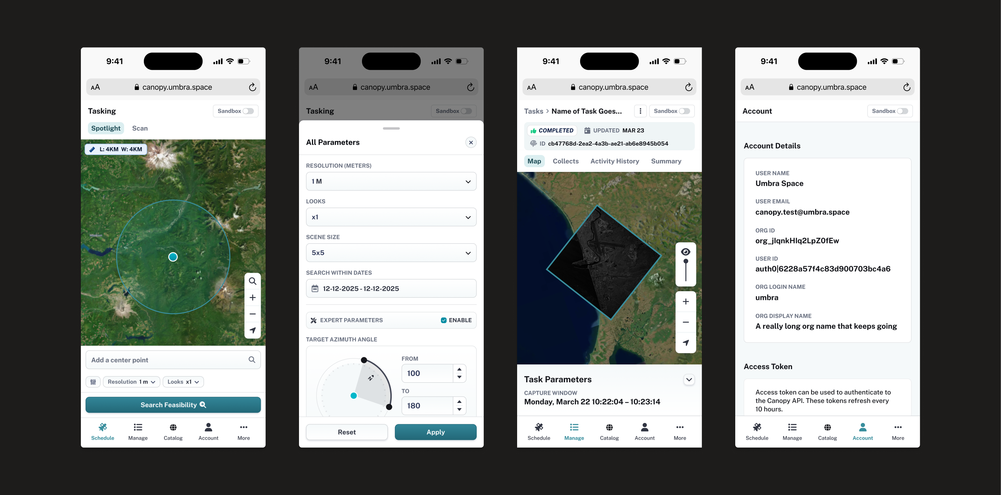
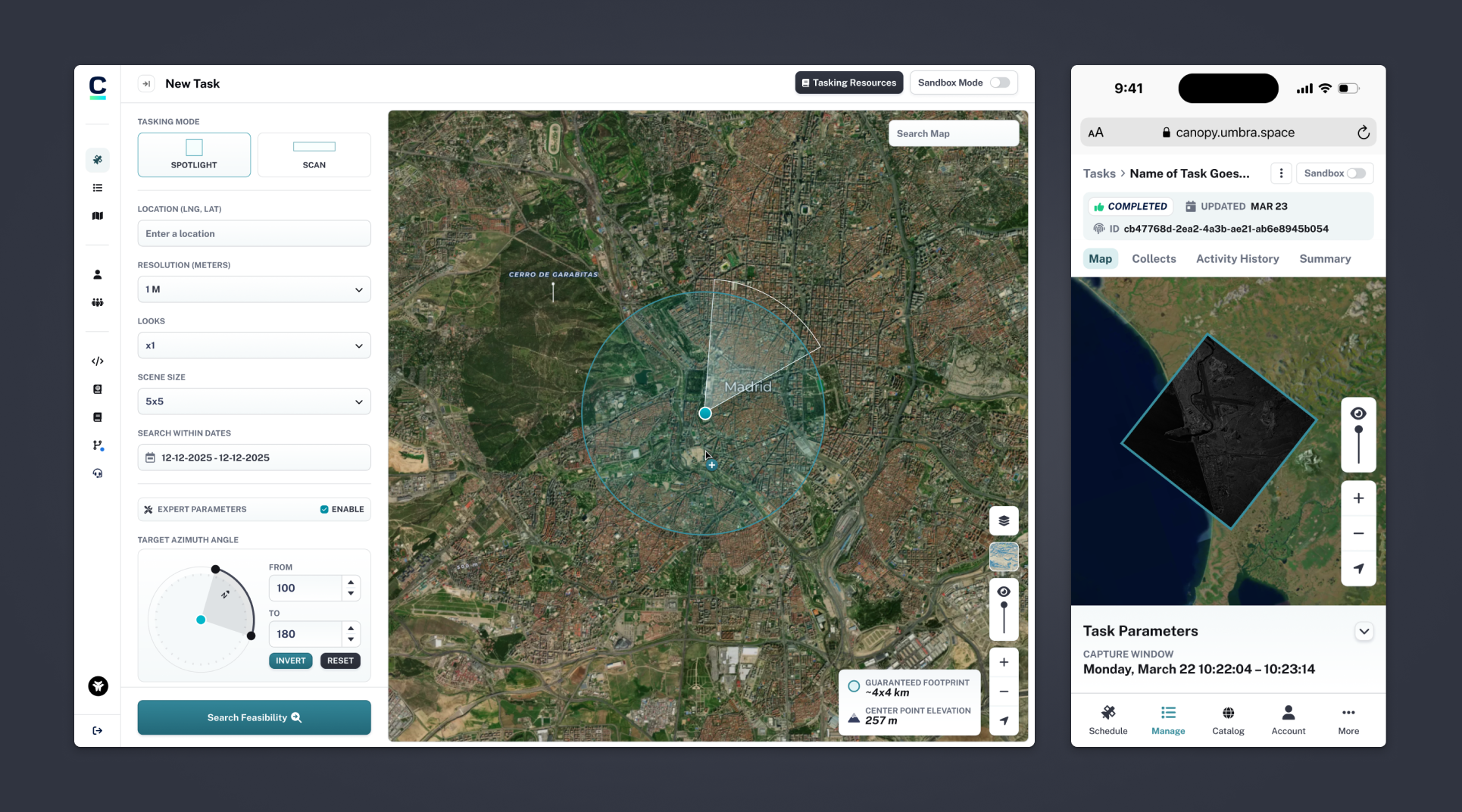
An improved tasking system
I packaged up my research into a report to help with sharing my research with business owners and key stakeholders. This allows me to get buy-in from those above by showing that proposals for improvements are well informed, and what there priority is.
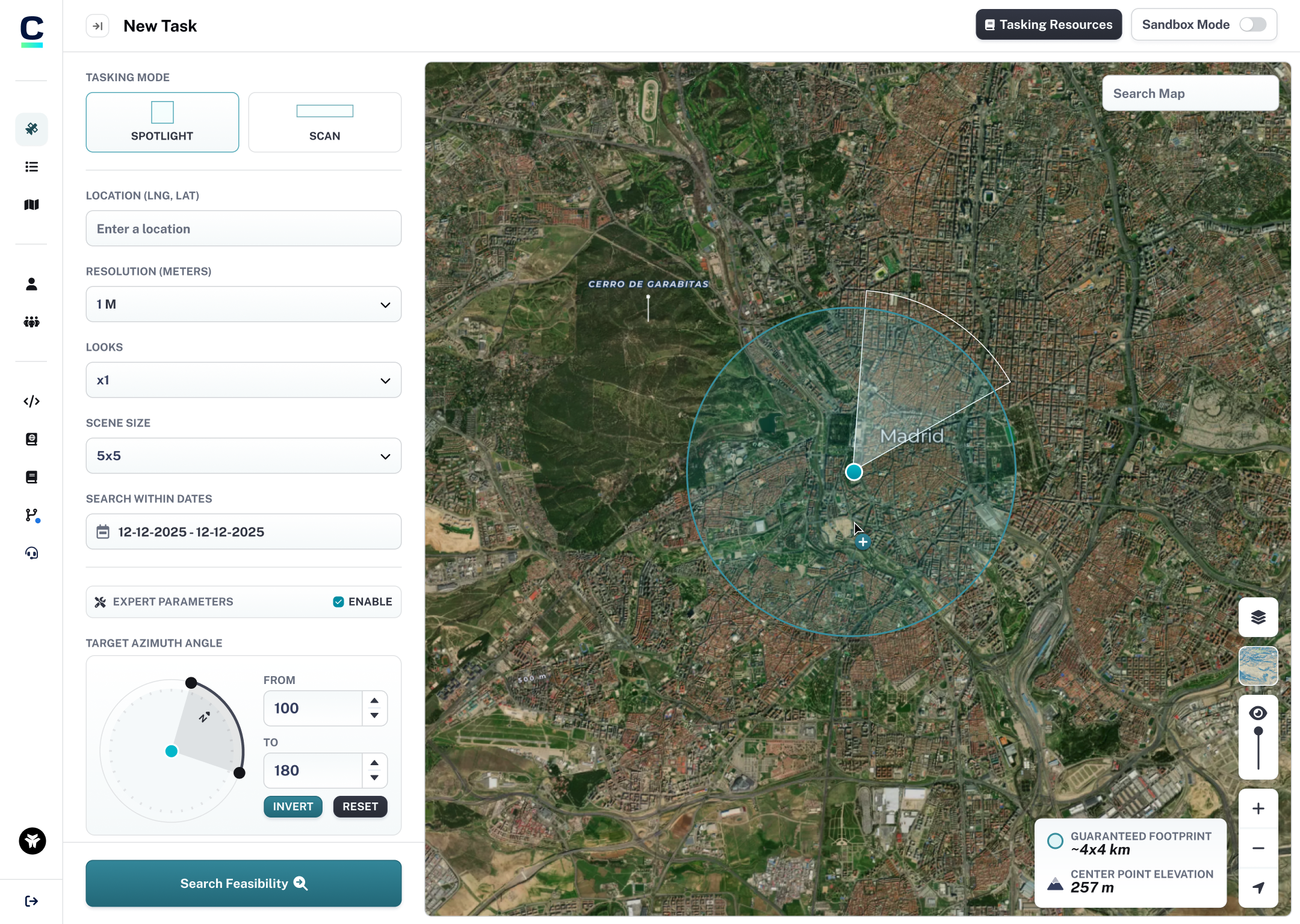
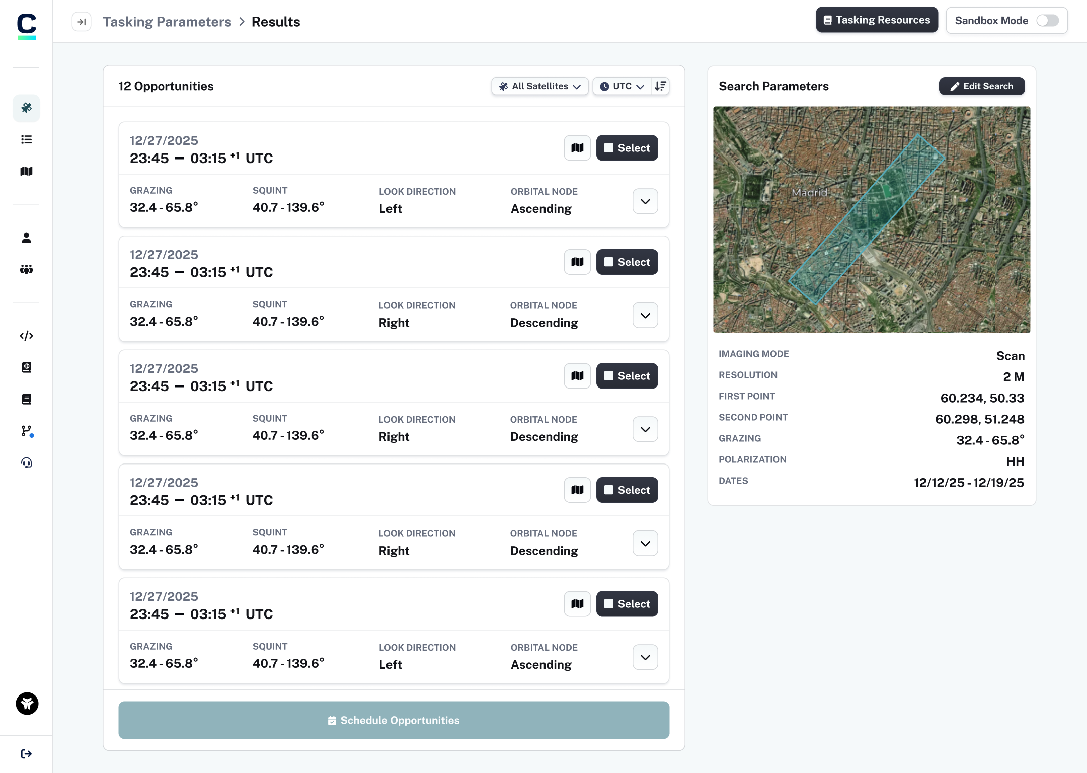
Advanced Parameters and Educational Content
I packaged up my research into a report to help with sharing my research with business owners and key stakeholders. This allows me to get buy-in from those above by showing that proposals for improvements are well informed, and what there priority is.
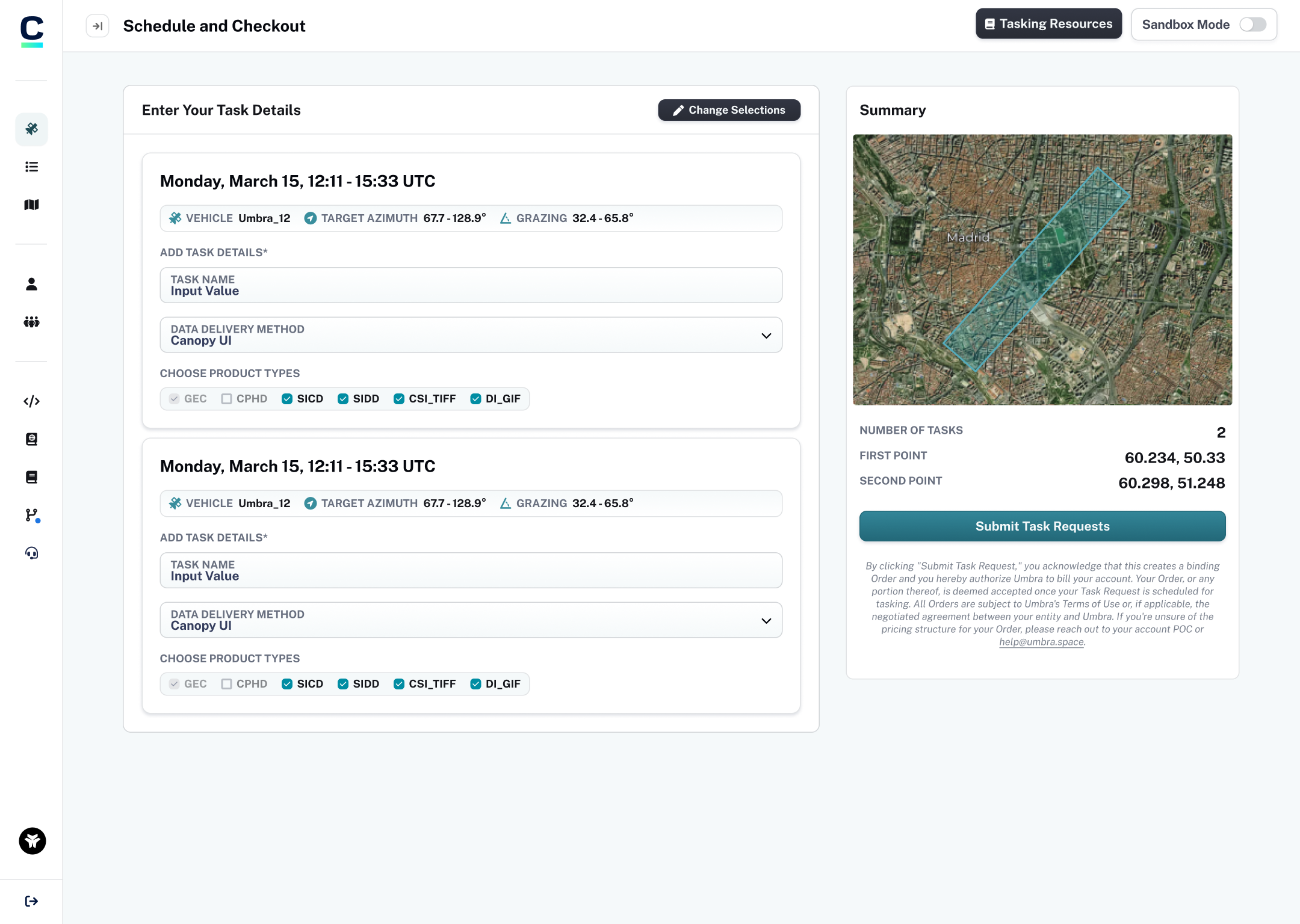
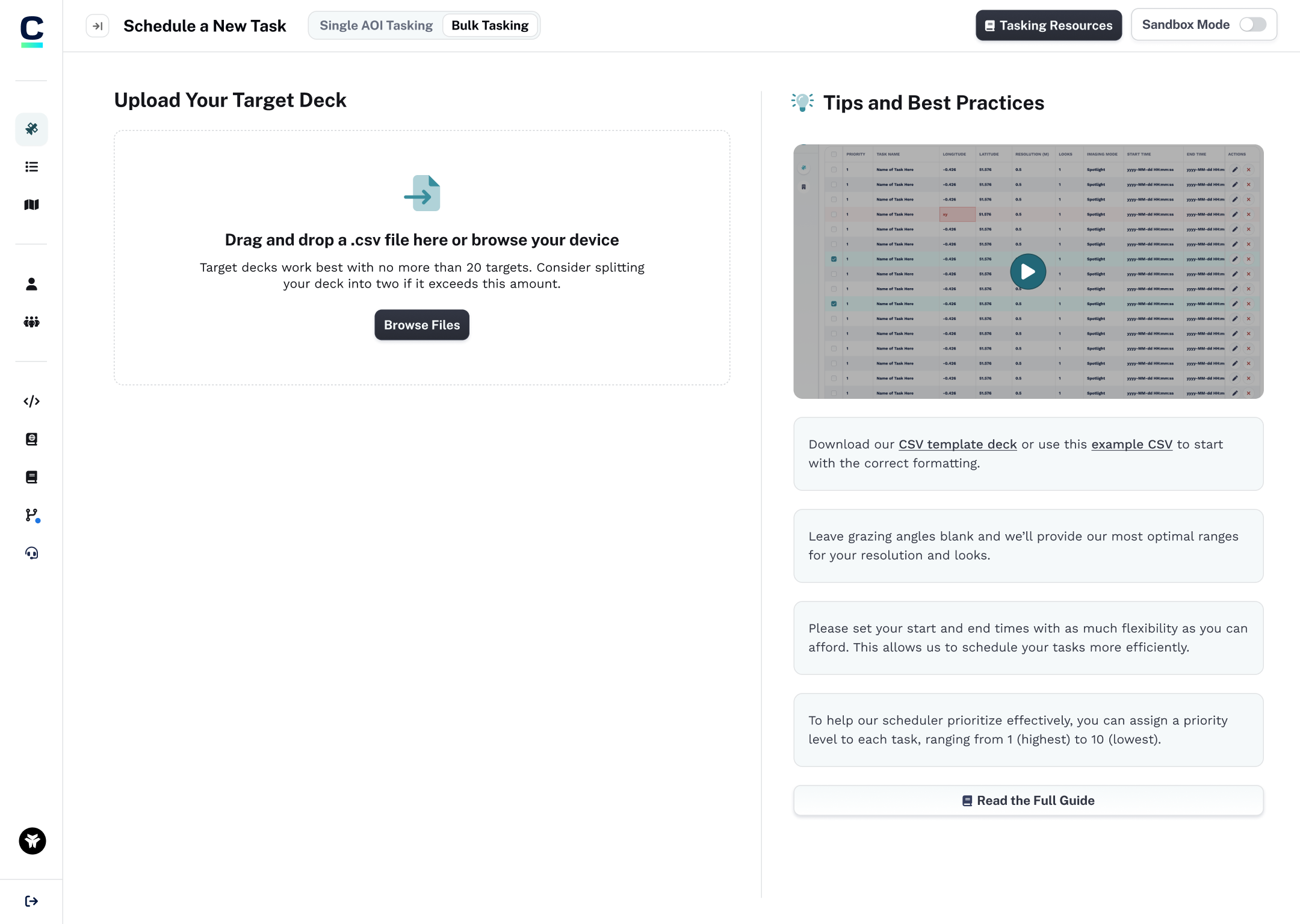
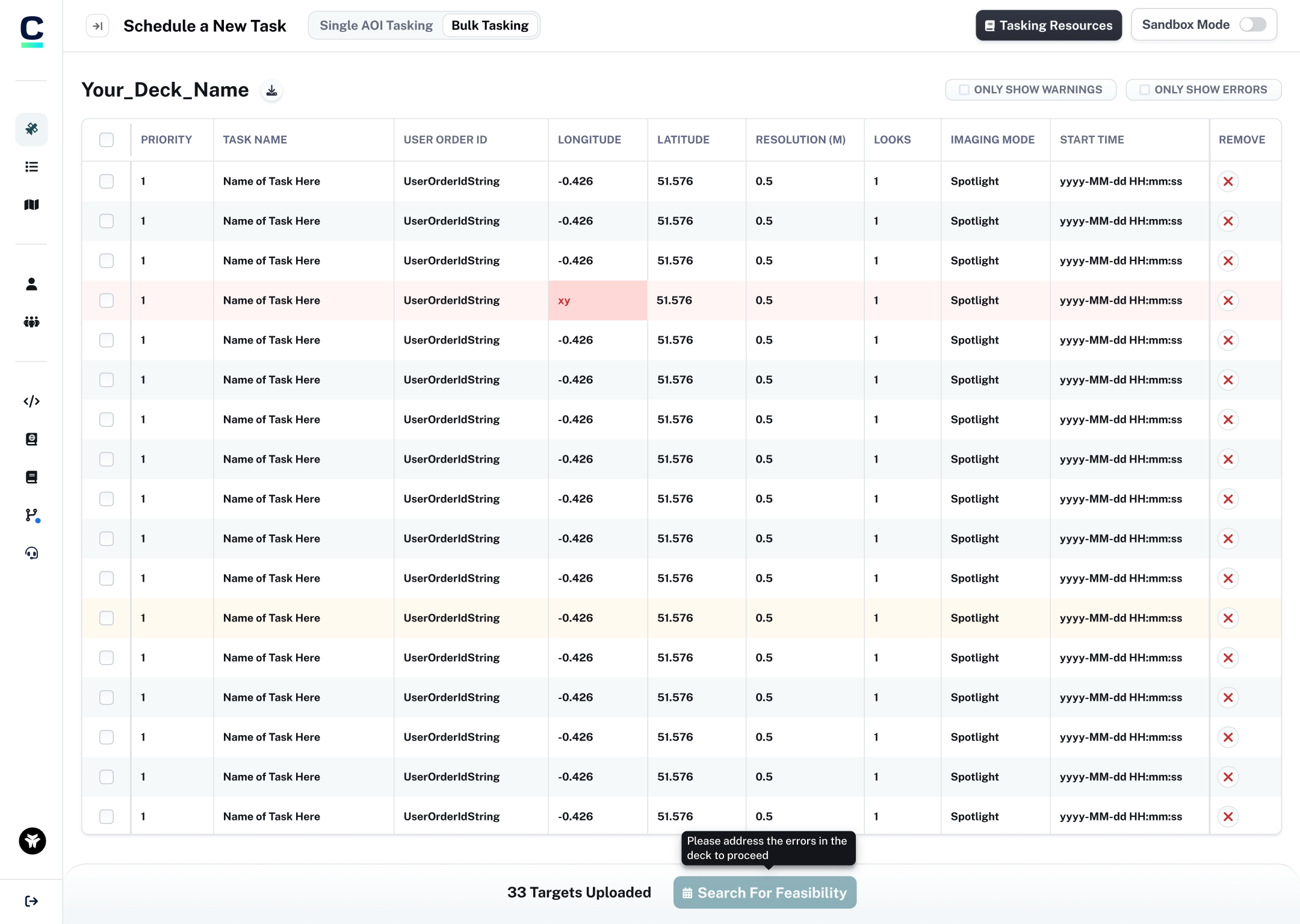
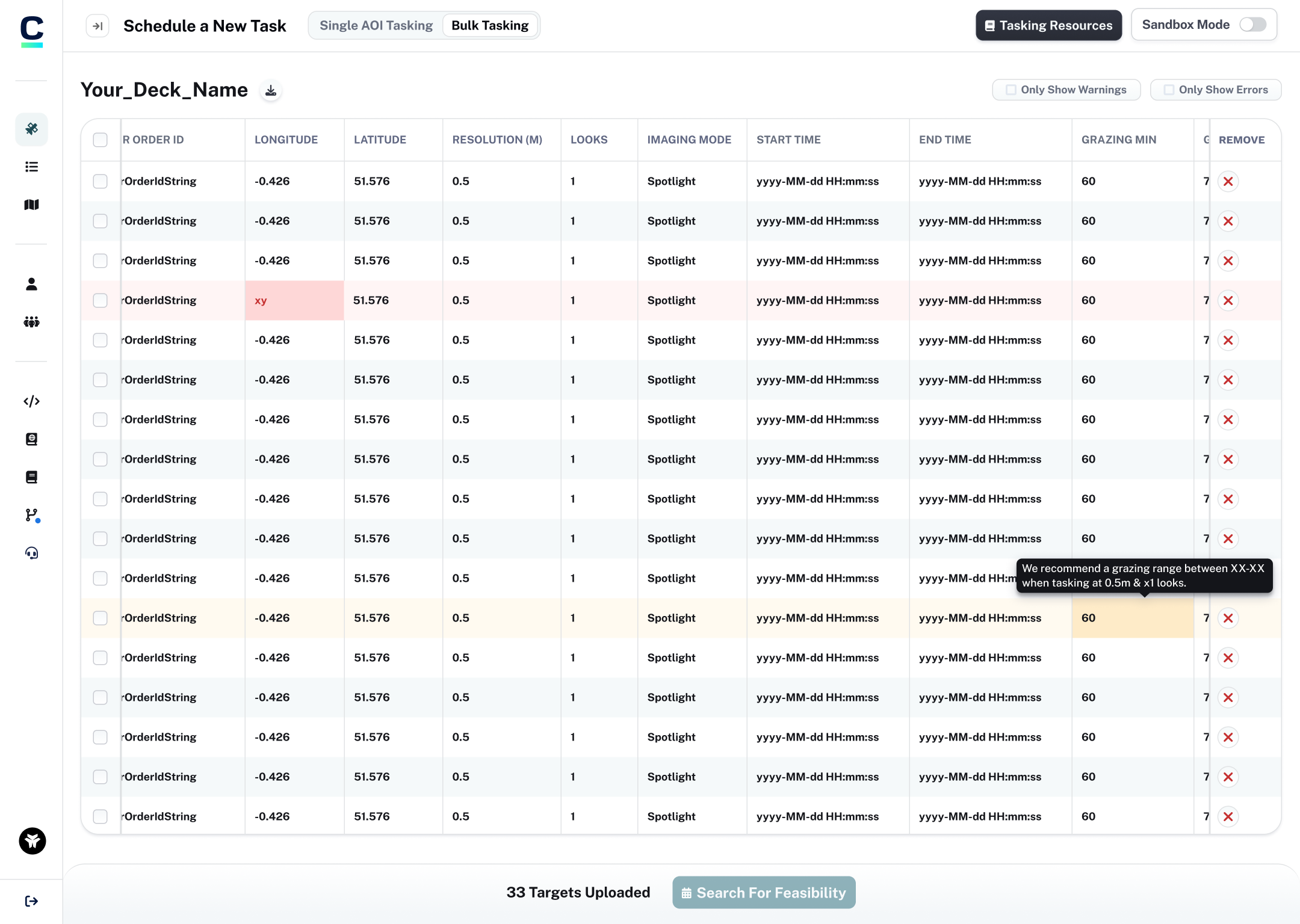
A bulk ordering system
A lot of our larger scale customers used white glove services (our team of tasking specialists) to task on their behalf, as they simply had too many targets to order in bulk and no way to do it via our self-service systems. Our internal team was able to create and refine internal APIs that let them do this efficiently. Harnessing the systems they’d designed, I was able to create an interface for users and take strain from our internal teams.
A new sidebar navigation
Users had expressed annoyance with the previous navigation, so I took the opportunity to redesign it to be more user-friendly. The new sidebar navigation allows users to easily access different sections of the app, and consolidates our top nav bar which previously had account settings, and our changelog.
Mobile optimized pages
I packaged up my research into a report to help with sharing my research with business owners and key stakeholders. This allows me to get buy-in from those above by showing that proposals for improvements are well informed, and what there priority is.